"It's not stock. It's Shutterstock." Worldwide Campaign
CHALLENGE
How do you translate a fresh, innovative rebrand into cohesive and culturally relevant campaigns across 21 languages and 150+ countries?
Shutterstock launched a bold rebrand that emphasized fresh, unexpected visuals and messaging, moving away from the stereotypical stock imagery. The tagline, "It's not stock. It's Shutterstock," aimed to communicate a new era of creative, dynamic content. In partnership with our agency of record, we needed to ensure this new look and feel were implemented not only in digital and print campaigns but also in our global offices, reinforcing the brand's identity from inside out.
OVERVIEW
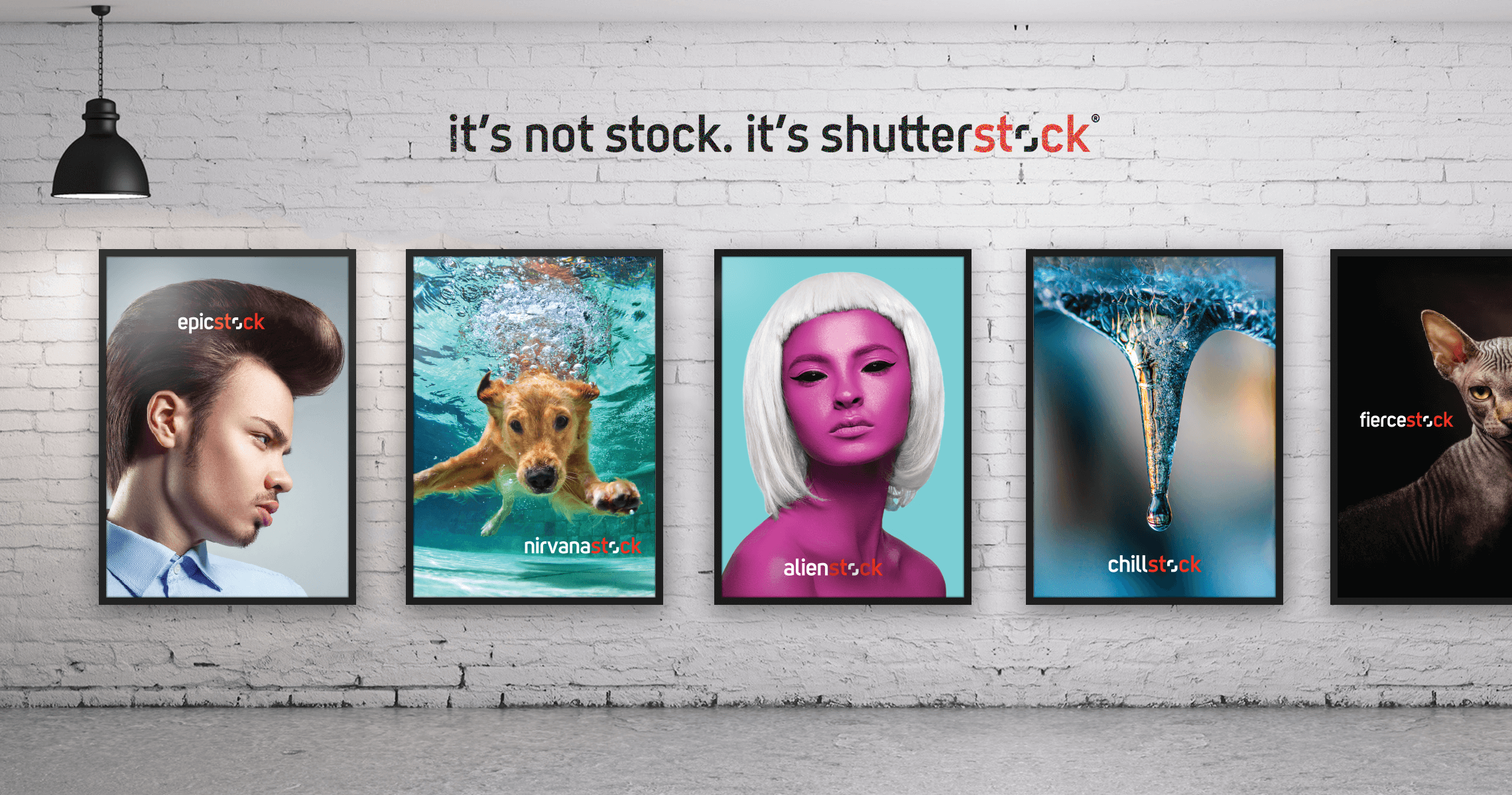
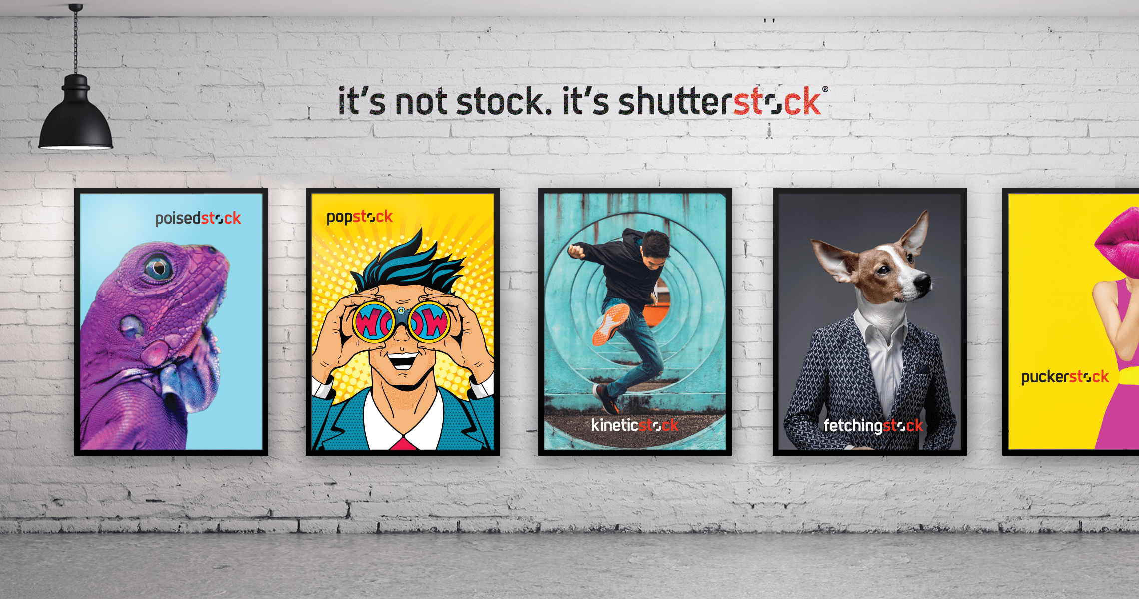
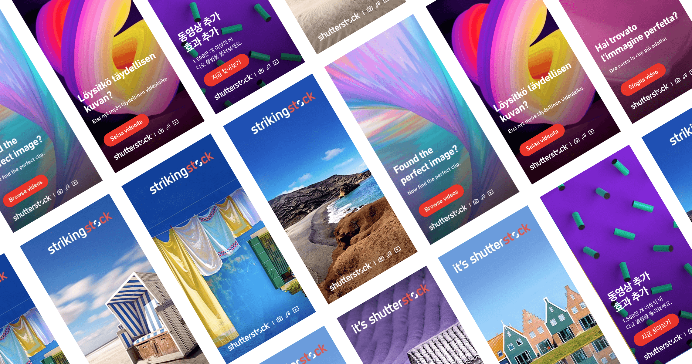
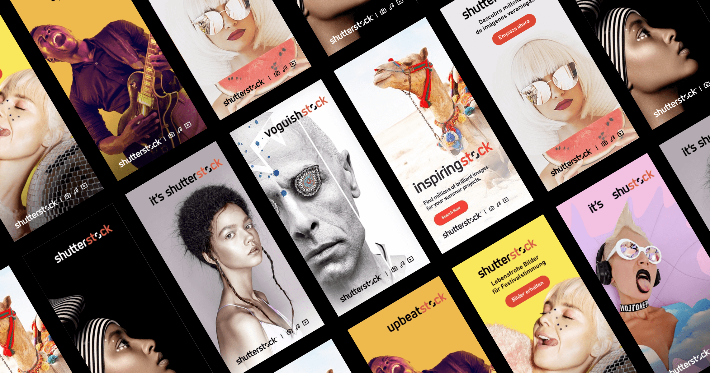
Shutterstock’s new look, developed in collaboration with our agency of record, embraced fresh and unexpected visuals, departing from the cliché stock imagery. The tagline “It’s not stock. It’s Shutterstock.” captured the brand’s renewed focus on authenticity. To reinforce this transformation, I partnered with printers in NYC and Europe to rebrand our physical offices, making the campaign a central visual presence in our global workspaces. The next step was to extend this bold vision worldwide, ensuring it resonated with diverse audiences.
SOLUTION
- Establishing Global Consistency:
- Developed a comprehensive brand style guide that outlined the visual and messaging principles to maintain brand integrity across all markets.
- Collaborated with local agencies in key regions to align creative execution with cultural nuances, ensuring relevance without compromising the campaign’s core message.
- Localized Visual Storytelling:
- Carefully curated region-specific imagery from Shutterstock’s vast library to highlight the most striking and locally resonant visuals.
- For European markets, for instance, this meant integrating vibrant local photography while experimenting with unique colors, angles, and thematic contrasts to align with the brand’s new aesthetic.
- Culturally Attuned Adaptations:
- Tailored campaign visuals for various contexts, such as music festivals in Europe, by focusing on the emotional and dynamic energy of live events.
- Strategically adapted fashion-oriented ads for global Fashion Week events, ensuring each piece captured the aspirational tone of the industry while remaining visually fresh.
RESULTS
The campaign rolled out as a series of visually captivating and regionally relevant ads, maintaining the aspirational and unexpected aesthetic that differentiated Shutterstock from its competitors. The localized imagery resonated deeply with audiences, reinforcing Shutterstock’s position as a global leader in authentic, high-quality visuals.
Services: Creative Strategy, Art Direction, Print Design, Brand Development, Global Campaign Management, Cross-Functional Team Collaboration